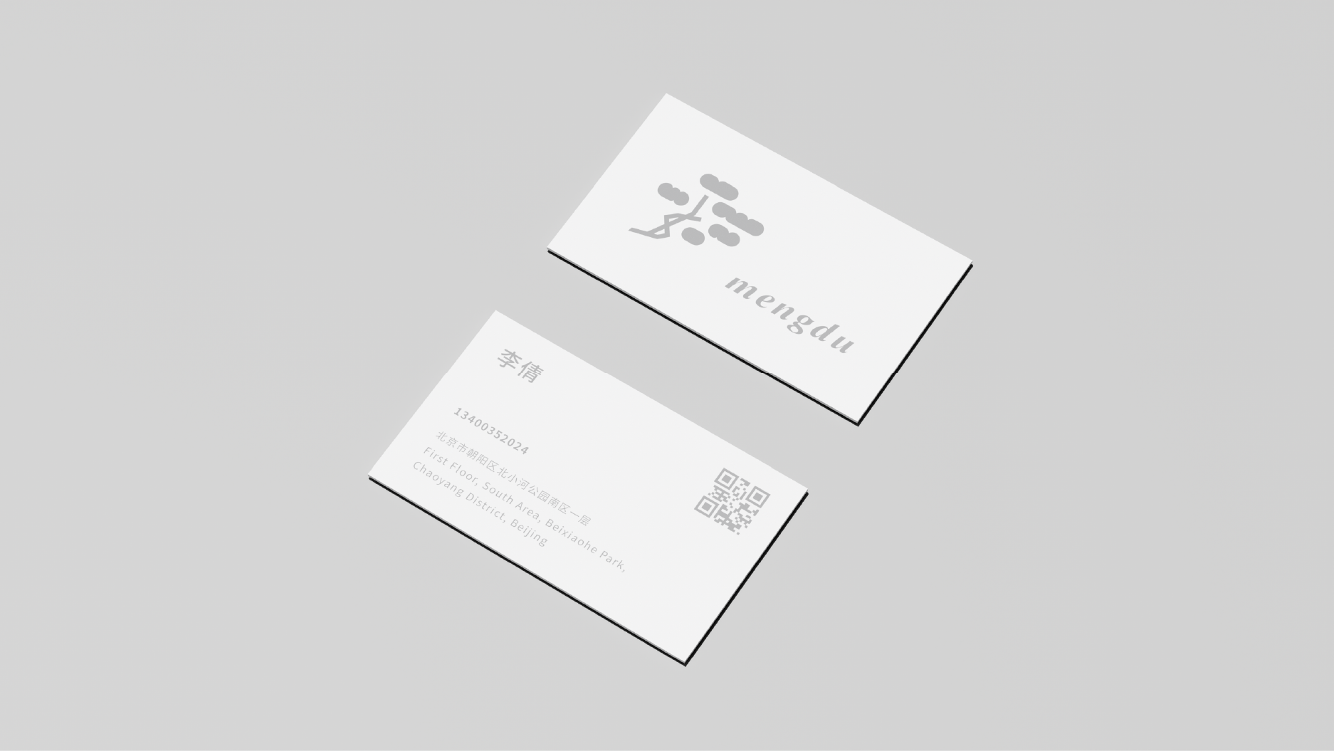
项目地址:北京
标志将极具安徽代表的迎客松元素进行几何化,以抽象干练的元素替代迎客松的复杂线条,以年轻化、扁平化的形式来适应时代的快速变化,品牌标准字用轻松流畅的笔触形式对字体进行风格改造,让整体透露出一种生活气息,配合图形让整体更加轻松、松弛。
The logo geometricizes the welcoming pine elements that are very representative of Anhui, replacing the complex lines of the welcoming pine with abstract and capable elements, and adapts to the rapid changes of the times with a younger and flat form. The brand standard characters are relaxed and smooth. The style of the font is modified in the form of strokes to give the whole a sense of life, and the graphics make the whole more relaxed and relaxed.