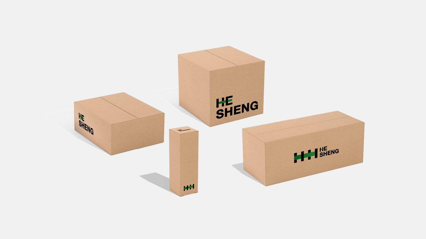
HESHENG 禾生
项目地址:北京
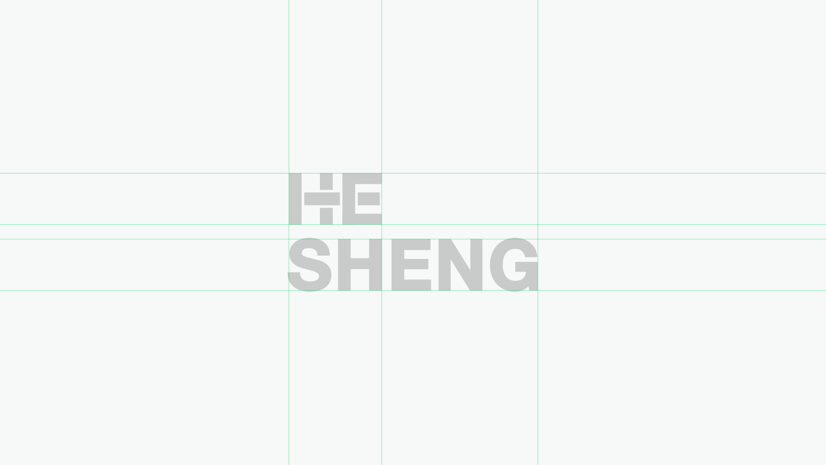
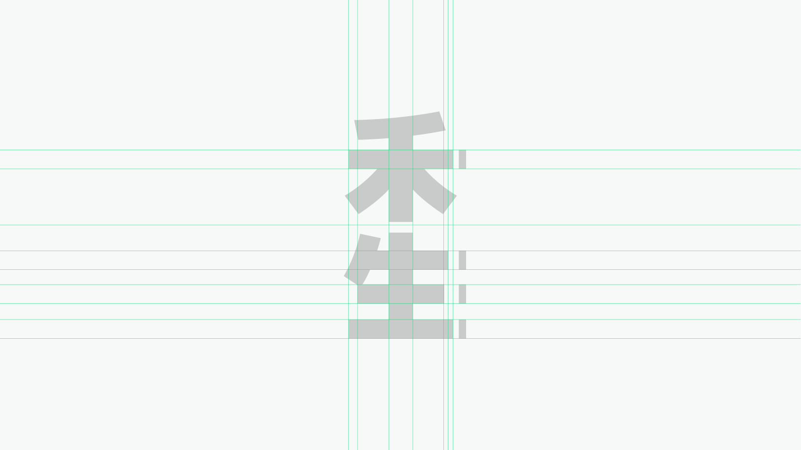
标志以一条绿色渐变线段贯穿始末,四条黑色线段与绿色线段的交织,以穿插的形式表现首字母“H”,与编织的相交概念,将禾生的四个主题以抽象的形式予以贯穿、交融,同时绿色线段不仅作用于图形部分,亦延伸至字母图形中,一抹绿色也将作为品牌核心色贯穿整个品牌形象构建。
The logo is characterized by a green gradient line running through the entire logo. The interweaving of four black and green lines expresses the initial letter "H" in an interlaced form, and the concept of weaving intersections, which runs through and blends the four themes of Hesheng in an abstract form. At the same time, the green line not only acts on the graphic part, but also extends to the letter graphics. A touch of green will also serve as the brand's core color throughout the entire brand image.