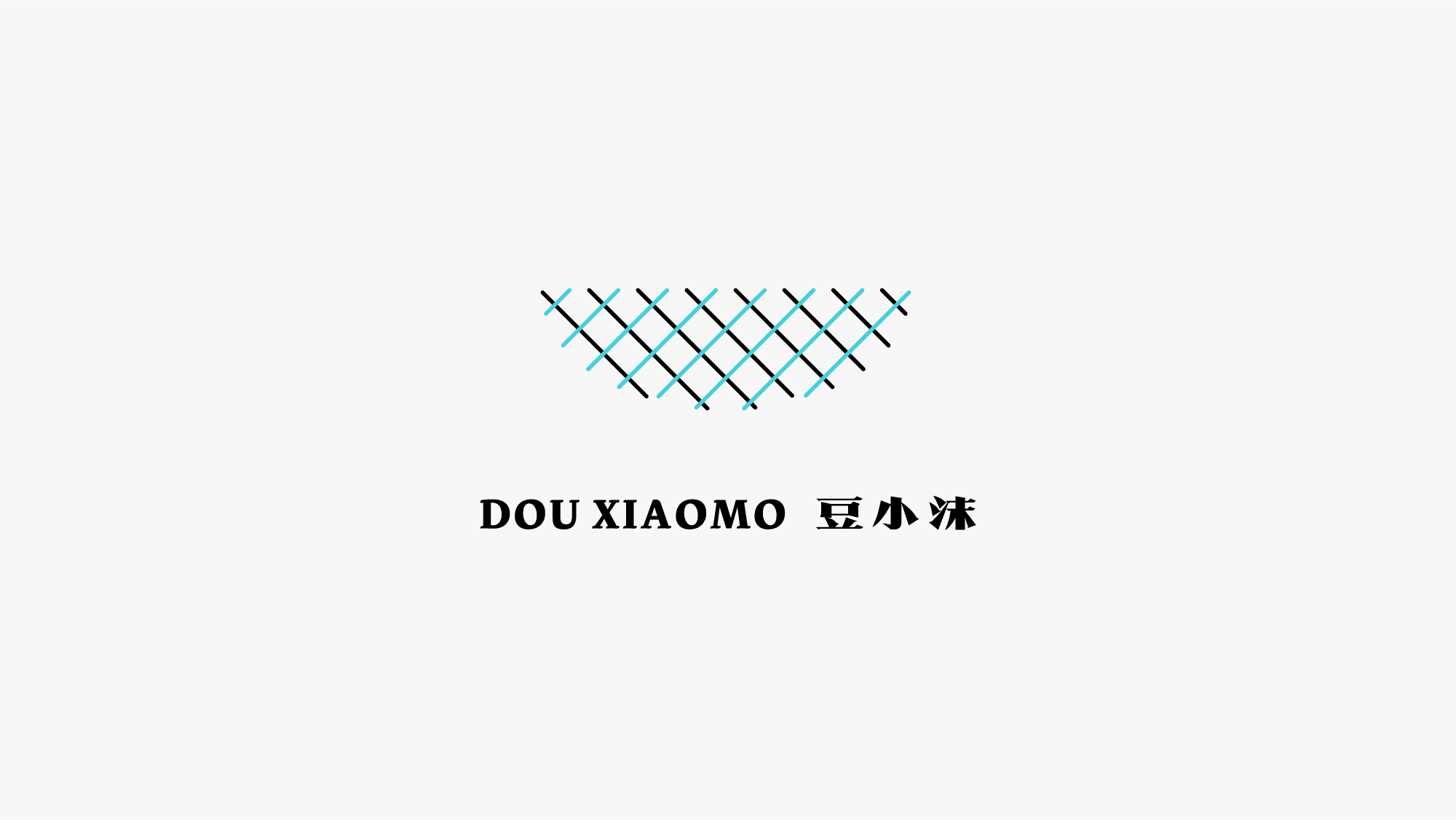
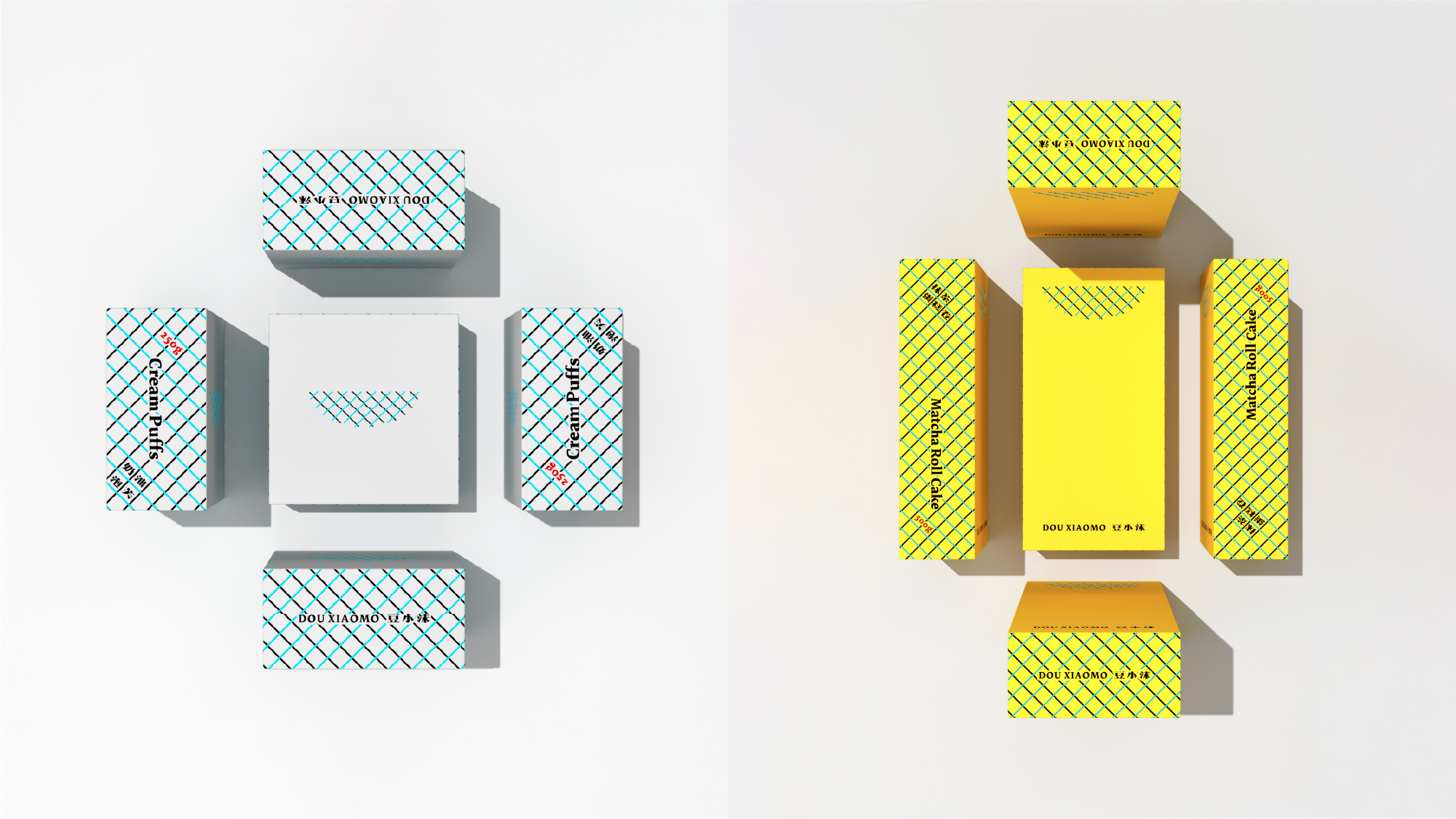
豆小沫 DOUXIAOMO
项目地址:西安
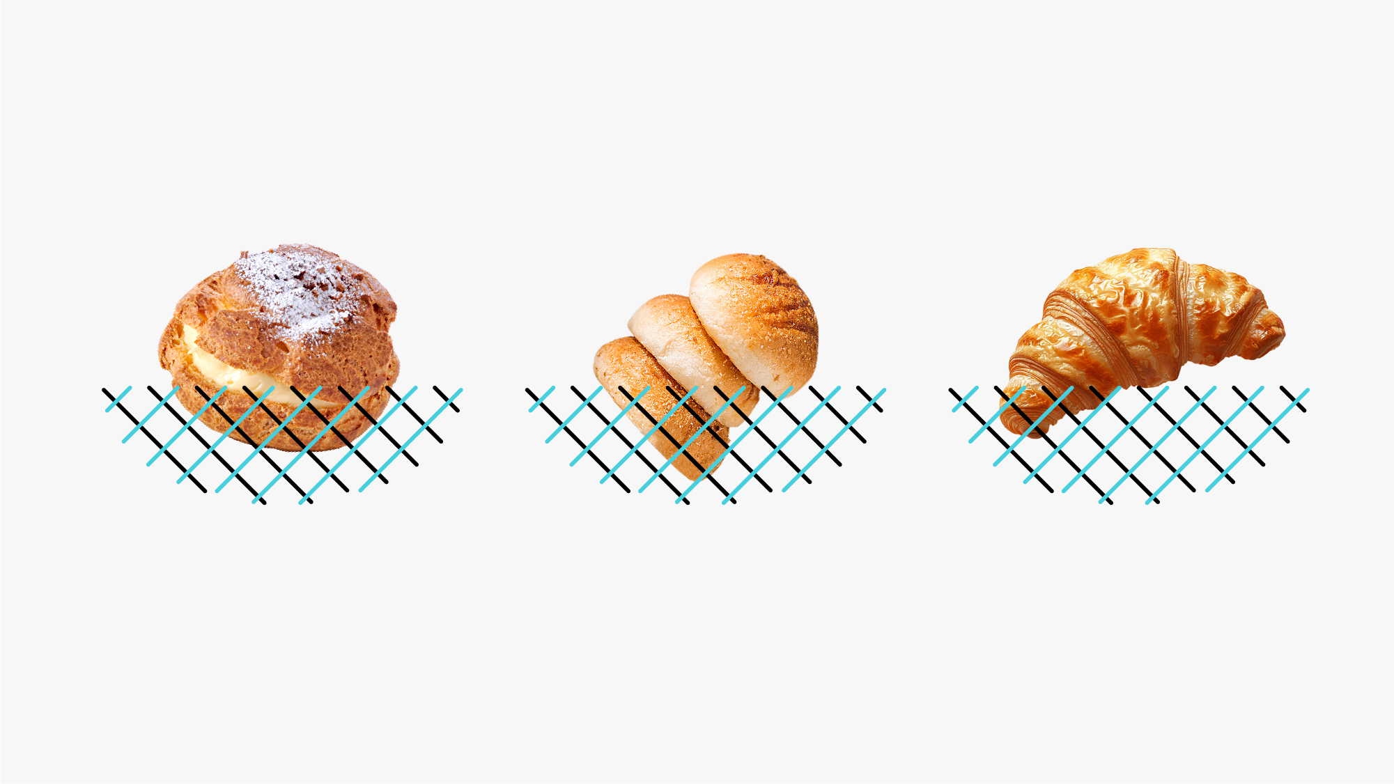
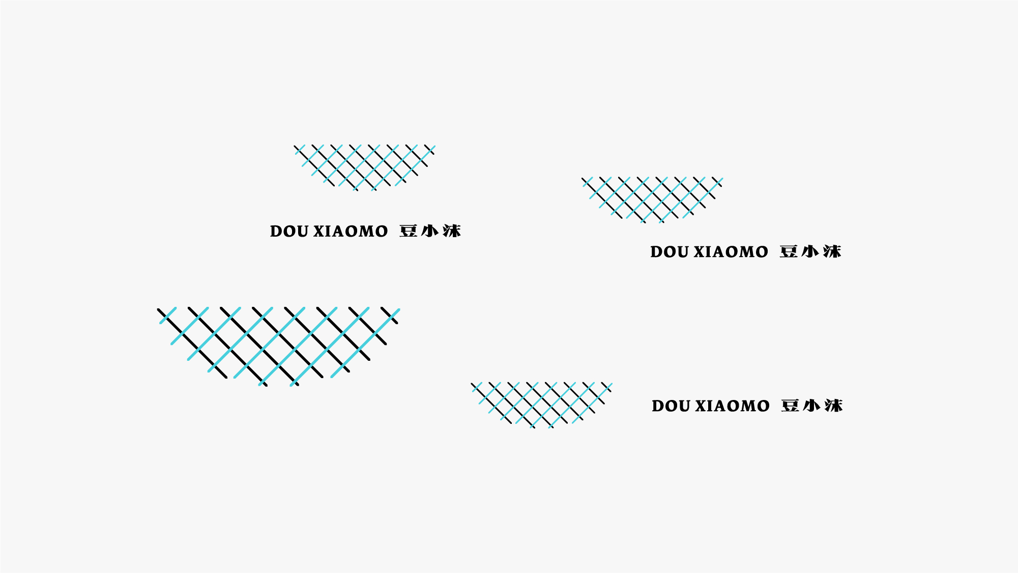
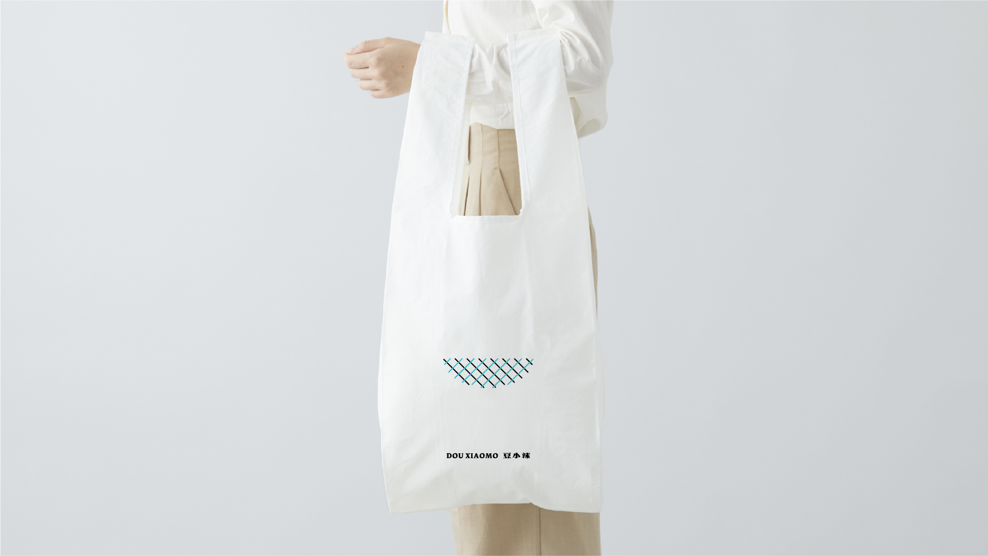
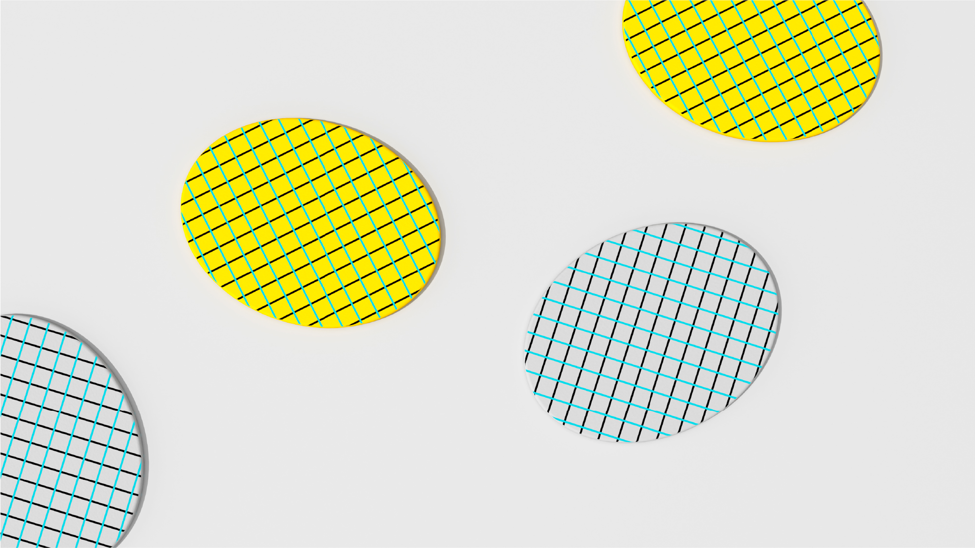
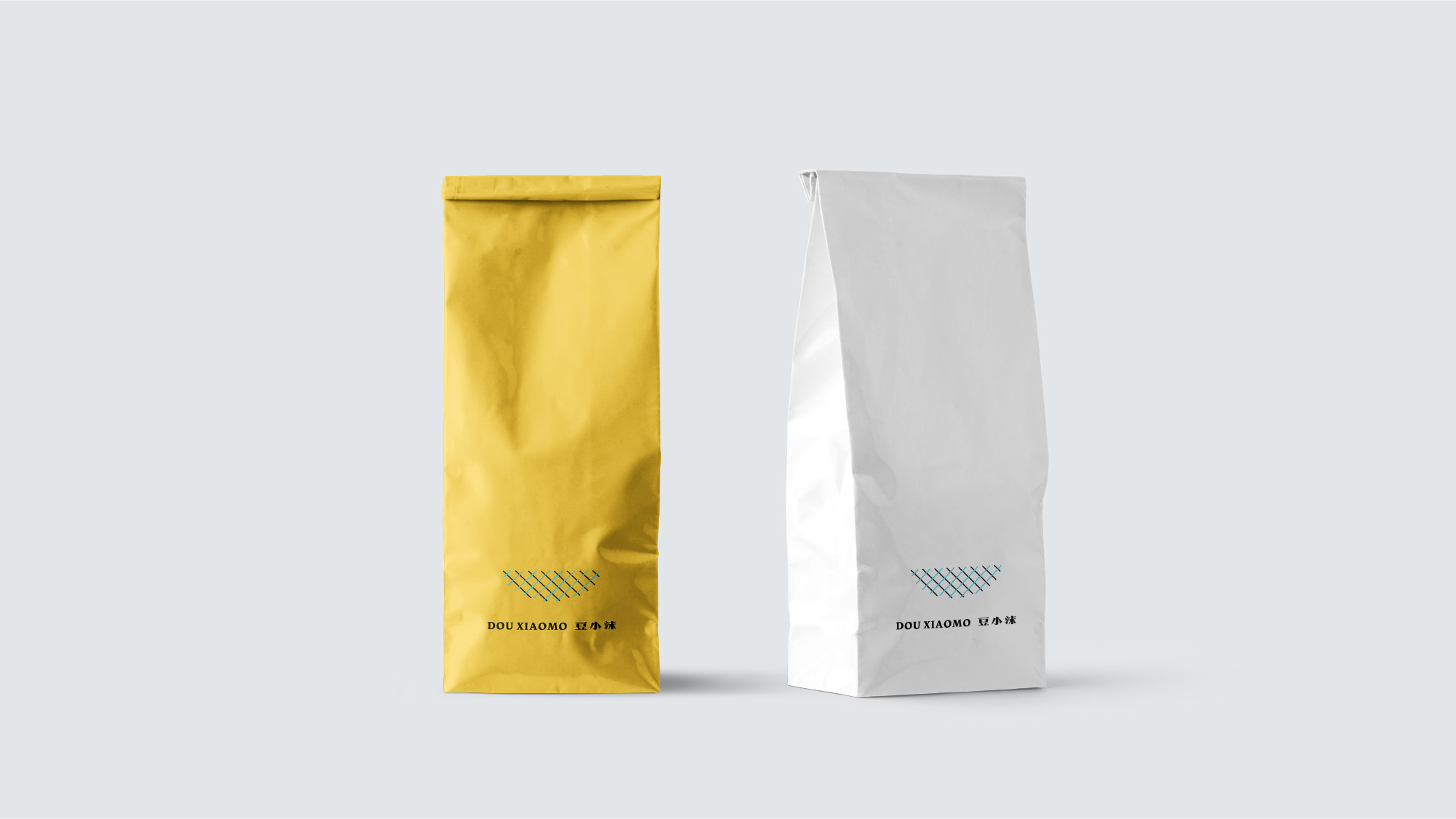
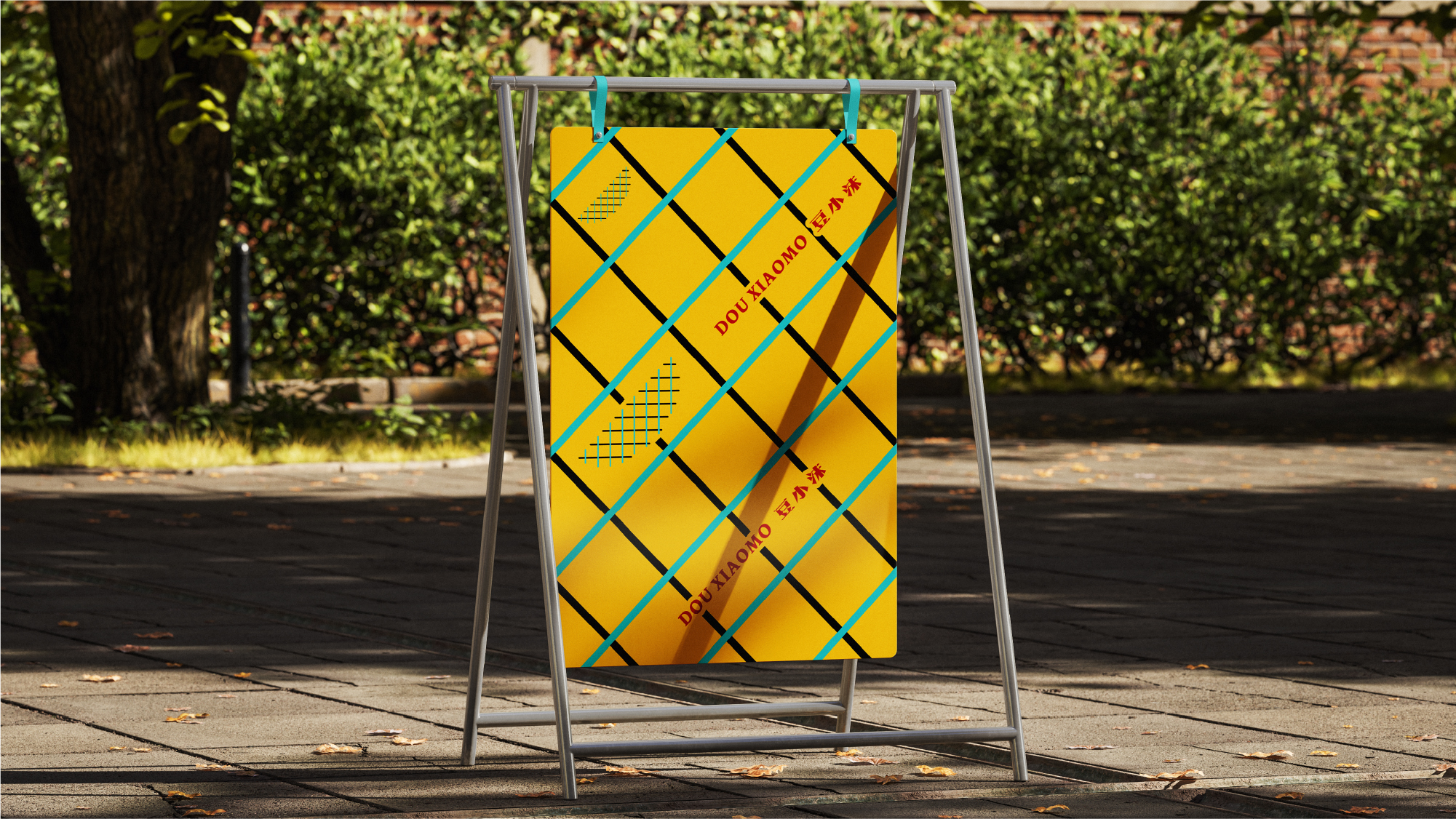
豆小沫作为糕点、小食品牌,在品牌形象上应该呈现出轻松、安全、健康的视觉印象,故将鸟窝的形象元素作为基础创意出发,鸟窝作为鸟类落脚、休息,以及哺育后代的场所,天然所具备安全、与轻松的属性,图形以线段的穿插组成类似编织的效果,在工业化的当下,给人以专业的手作匠人感,如一顶竹篮,装放着各式各样的小食糕点。
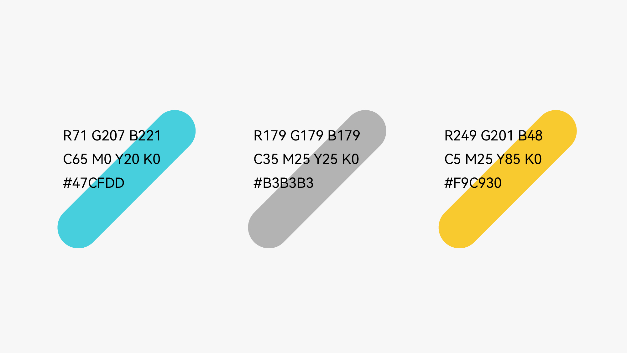
色彩摒弃了食品常用的红、橙等鲜艳、具有冲击的色彩,而选用了一抹青蓝色,让人眼前一亮的同时又有轻巧、愉悦的氛围感。
As a brand of pastries and snacks, Douxiaomo should present a relaxed, safe and healthy visual impression in its brand image. Therefore, the image element of the bird's nest is used as the basic creative starting point. As a place for birds to settle, rest, and feed their offspring, the bird's nest naturally has the attributes of safety and relaxation. The graphic is composed of interlaced line segments to form a weaving effect. In the current industrialization, it gives people a sense of professional handcraftsmanship, such as a bamboo basket, which is filled with a variety of snacks and pastries.
The color abandons the bright and impactful colors commonly used in food, such as red and orange, and chooses a touch of blue, which makes people bright and has a light and pleasant atmosphere.