项目地址:北京、南京
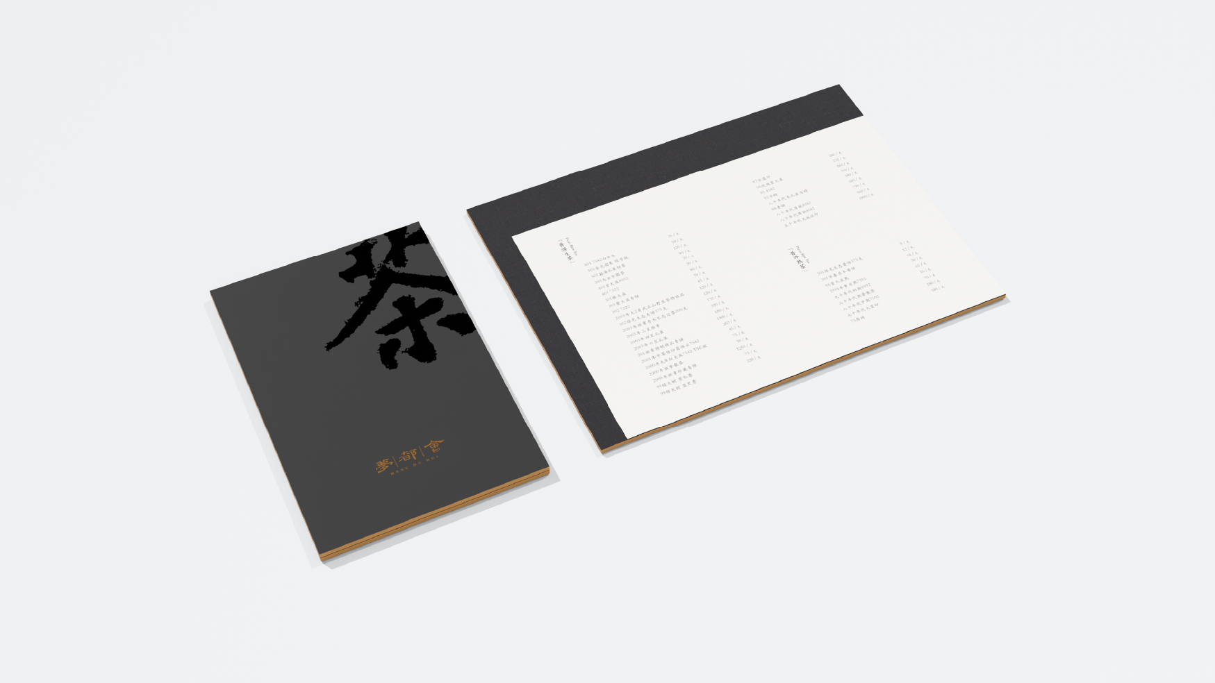
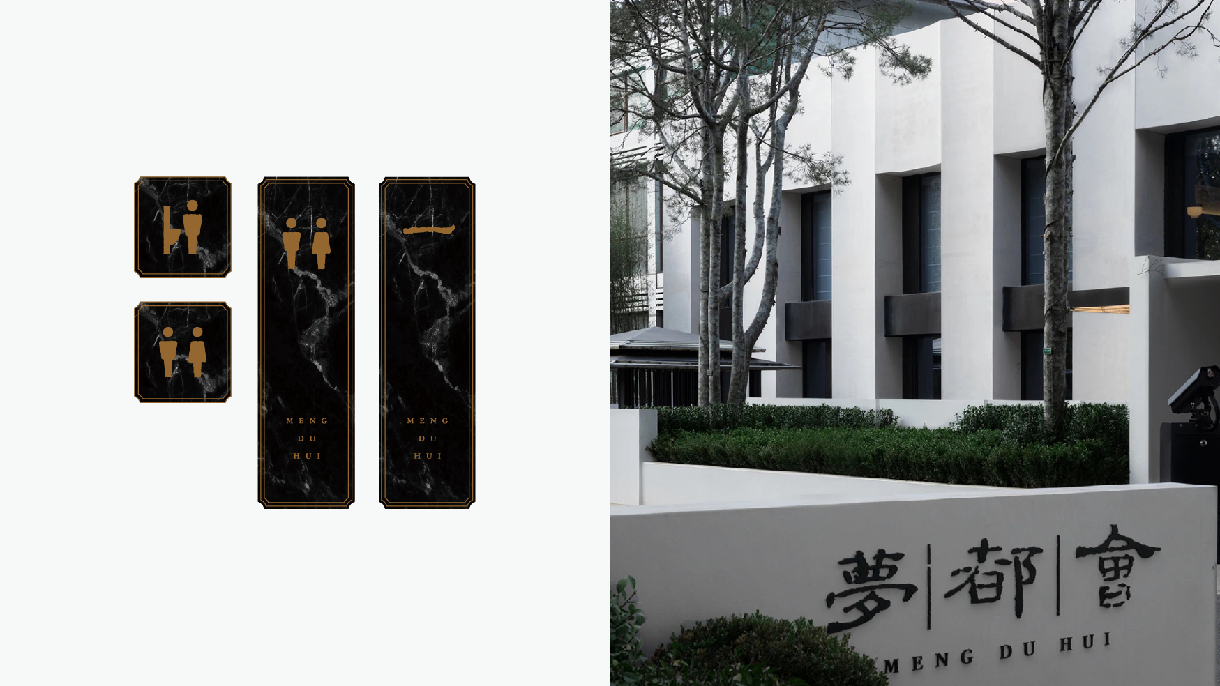
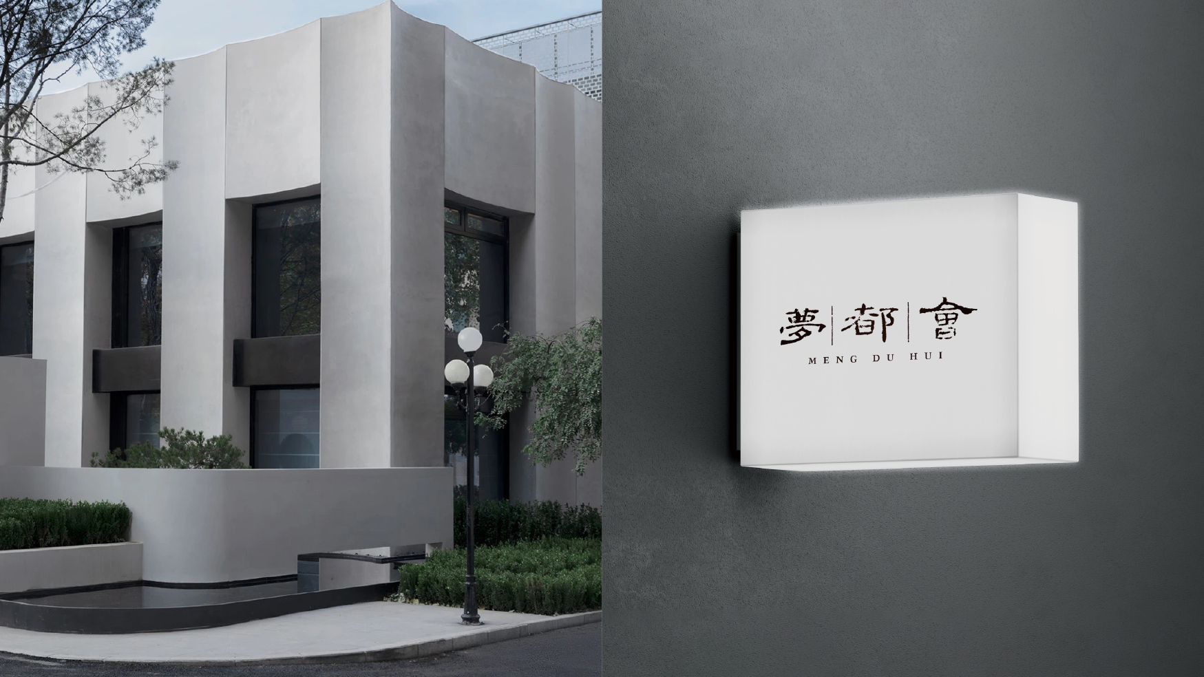
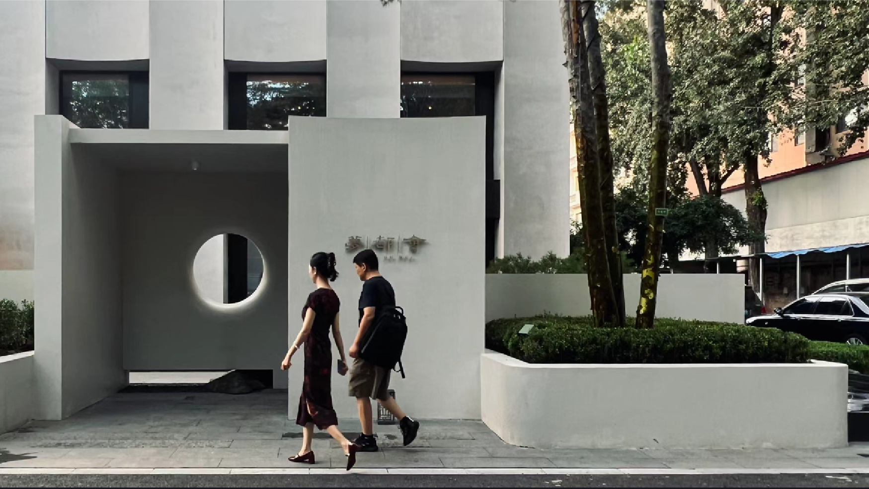
标志舍弃了原有的图形元素,从更具传播认知的文字着手,摒弃了原先的设计字体,回归传统,从经典着手,选用隶书的框架,从传统汉碑中提取,并保留残破的效果,任其保留历时的痕迹,并具有承载更多人文气息的条件,让品牌具有传承感的同时更加符合品牌新阶段的发展。
The logo abandoned the original graphic elements and started with words that are more communicative. It abandoned the original design font and returned to tradition. It started from the classics and chose the framework of official script, which was extracted from traditional Han steles and retained the broken effect. , allowing it to retain the traces of time and have the conditions to carry more humanistic atmosphere, giving the brand a sense of heritage and being more in line with the new stage of brand development.