项目地址:北京
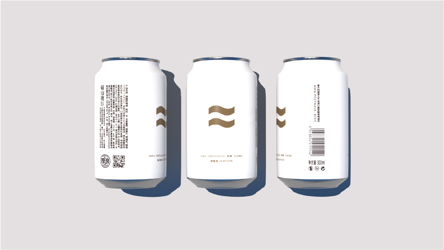
包装摒弃传统啤酒的设计思维,提出“约等号”的超级符号与浪相结合,作为品牌的视觉主导,恰当的将厚浪与约等于的概念相融合,表达出“厚浪,约等于......”的品牌逻辑。并在包装的整体上尽可能的干净,贯彻出约等的纯粹性。
The packaging abandons the traditional design thinking of beer and proposes the combination of the supersymbol of "about equal sign" and the wave as the visual dominant of the brand. It appropriately integrates the concepts of thick waves and about equal, expressing the brand logic of "thick waves, about equal to...". And as clean as possible in the overall packaging, embodying the purity of equality.