项目地址:贵州
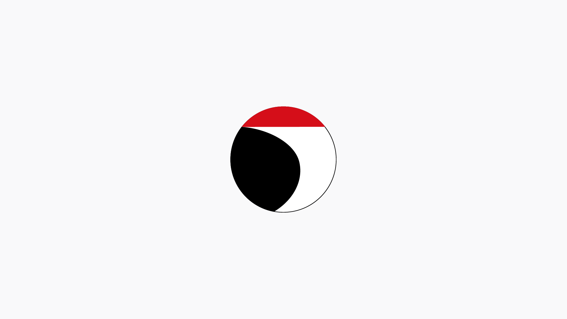
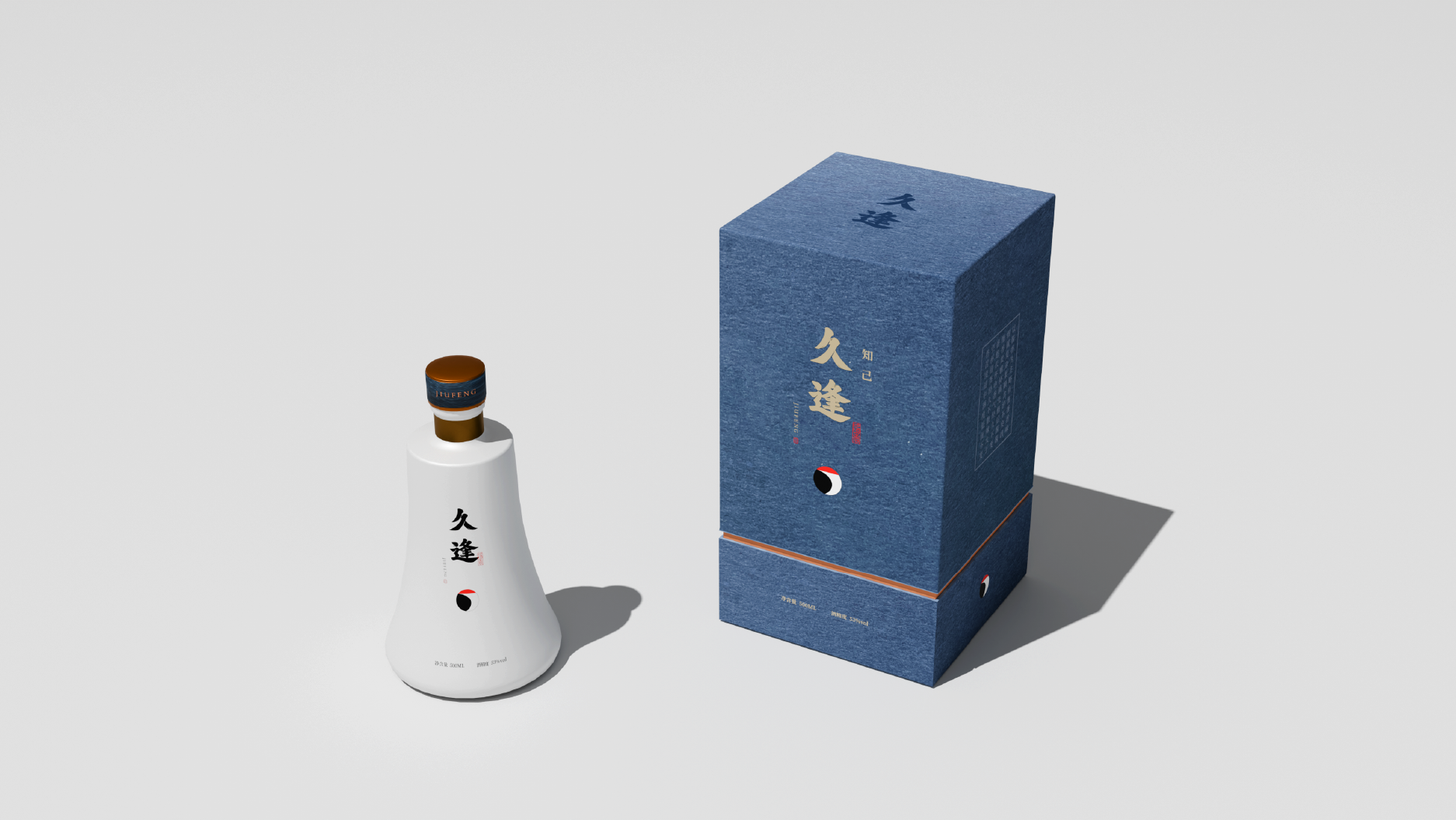
久逢陈酿,久别与重逢,遂图形创意以仙鹤为出发点,期许友谊的长久延年,又赋予其杯中酒的极简现代手法为呈现,文字参考古时楷书神韵,让现代的图形带入传统的公式中,两者相辅,不过于形式又不过于传统的新时代中式白酒品牌。
After a long time of aging, long separation and reunion, the graphic design takes the crane as the starting point, expects the long-lasting friendship, and gives the wine in the cup a minimalist and modern way of presentation. The text refers to the charm of ancient regular script, and brings modern graphics into the In the traditional formula, the two complement each other, a new era Chinese liquor brand that is neither too formal nor too traditional.